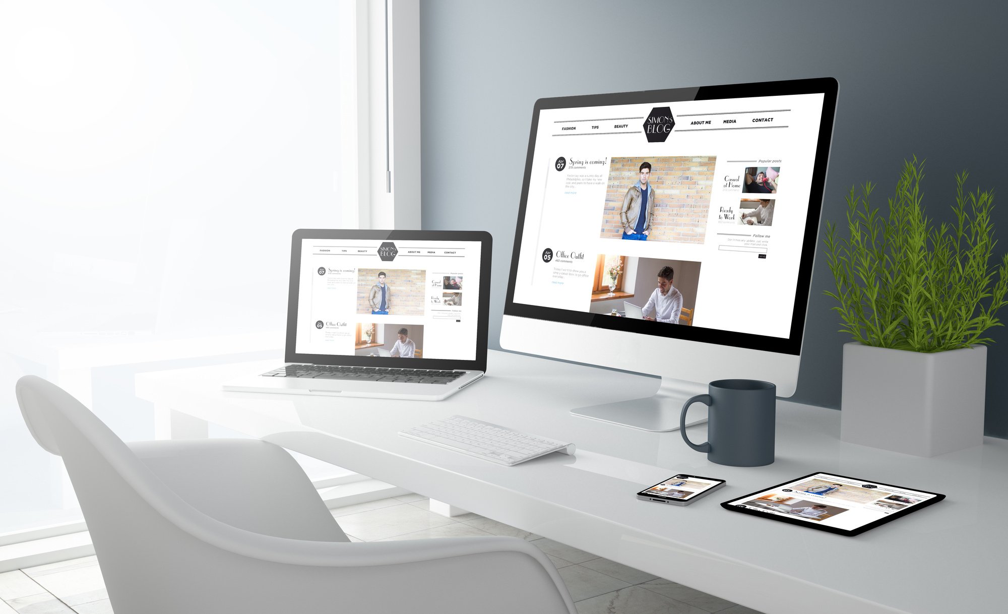
Responsive web design is an approach to designing and developing websites that ensures the website’s layout and content adjust dynamically to the size and orientation of the user’s device screen, whether it is a desktop computer, tablet, or smartphone.
Mobile devices, such as smartphones and tablets, have become the primary means of accessing the internet for many users. In fact, mobile usage has surpassed desktop usage in recent years. With a responsive web design, businesses can ensure that their website is optimized for all devices and screen sizes, providing a better user experience for mobile users.
Responsive web design ensures that the website’s layout and content adjusts dynamically to the screen size of the user’s device. This leads to a consistent and optimized user experience, regardless of the device being used. A website with a poor user experience can lead to high bounce rates and lost business opportunities.
Google has stated that responsive web design is its recommended approach for mobile optimization. Websites that are not mobile-friendly may receive lower rankings in search results, making it harder for potential customers to find the website.
Maintaining multiple versions of a website for different devices can be time-consuming and costly. With responsive web design, businesses can manage a single website that works across all devices, reducing development and maintenance costs over time.
Mobile-optimized websites tend to load faster than desktop websites on mobile devices. Faster load times can lead to improved engagement and lower bounce rates, which can ultimately improve the website’s performance.
WHAT’S INCLUDED?
6 Benefit of Responsive Web Design
1. Improved User Experience
Responsives web design ensures that the website's layout and content adjusts dynamically to the screen size of the user's device, providing a consistent and optimized user experience across all devices.
2. Increased Mobile Traffic
With the growing use of mobile devices to access the internet, having a responsive website can help businesses capture more mobile traffic and improve engagement with mobile users.
3. Better Search Engine Rankings
Google favors mobile-friendly websites in search results. By using responsives web design, businesses can improve their search engine rankings, making it easier for potential customers to find their website.
4. Easier Maintenance
Maintaining multiple versions of a website for different devices can be time-consuming and costly. With responsives web designs, businesses can manage a single website that works across all devices, reducing maintenance costs and streamlining website updates.
5. Faster Website Performance
Mobile-optimized websites tend to load faster than desktop websites on mobile devices, which can lead to improved engagement and lower bounce rates.
6. Cost-Effective
Responsives web designs can be a cost-effective solution for businesses, as it eliminates the need to create and maintain separate desktop and mobile websites. This can result in lower development and maintenance costs over time.
