ADMK Solutions has long been at the forefront of the digital marketing and development landscape, providing comprehensive services that span UI/UX design, website development, mobile app development, eCommerce solutions, and SEO marketing. Our commitment to excellence and client satisfaction has driven us to continuously innovate and stay ahead of industry trends. In 2024, our custom UI/UX dashboard design services stand out as a testament to our dedication to delivering exceptional digital experiences.
The Importance of UI/UX Design
User Interface (UI) and User Experience (UX) design are critical components in the creation of digital products. A well-designed UI ensures that the product is visually appealing and intuitive, while an optimized UX guarantees that users have a seamless and enjoyable interaction with the product. In the context of dashboards, which are often used for data visualization and management, effective UI/UX design can significantly enhance usability, reduce learning curves, and improve overall productivity.
ADMK Solutions Approach to UI/UX Dashboard Design
At ADMK Solutions, we understand that each client has unique needs and objectives. Our approach to UI/UX dashboard design is tailored to meet these specific requirements, ensuring that the final product is not only functional but also aligns with the client’s brand identity and goals. Here’s how we achieve this:
Understanding Client Needs
The first step in our process is to thoroughly understand the client’s needs. This involves detailed discussions and consultations to gather information about the client’s business, the purpose of the dashboard, the target audience, and any specific features or functionalities that are required. We also analyze any existing dashboards or systems to identify areas for improvement.
Research and Planning
Once we have a clear understanding of the client’s needs, our team conducts extensive research to identify the best practices and latest trends in UI/UX dashboard design. We look at competitor products, industry standards, and innovative solutions to inform our design strategy. This research phase is crucial for ensuring that our designs are not only modern and cutting-edge but also grounded in proven methodologies.
Wireframing and Prototyping
With the research insights in hand, our designers create wireframes and prototypes. Wireframes are basic layouts that outline the structure and key elements of the dashboard, while prototypes are more detailed and interactive models that simulate the user experience. This stage allows us to visualize the design, experiment with different layouts, and gather feedback from the client before moving on to the final design.
Visual Design
Our visual design phase focuses on creating a polished, aesthetically pleasing interface. We pay close attention to color schemes, typography, iconography, and overall visual hierarchy. Our goal is to create a cohesive design that is not only beautiful but also enhances usability by guiding the user’s attention to the most important elements and actions.
Development and Integration
Once the design is finalized, our development team takes over to bring the design to life. We use advanced UI/UX tools and technologies to ensure that the dashboard is responsive, fast, and compatible with various devices and platforms. Our developers work closely with the designers to ensure that the final product matches the design specifications and delivers a seamless user experience.
Testing and Feedback
Before launching the dashboard, we conduct rigorous testing to identify and resolve any issues. This includes usability testing, performance testing, and compatibility testing. We also gather feedback from the client and end-users to ensure that the dashboard meets their needs and expectations. Any necessary adjustments are made based on this feedback to ensure the highest level of satisfaction.
Advanced UI/UX Tools Used by ADMK Solutions
In 2024, the landscape of UI/UX design tools has evolved significantly, offering more advanced features and capabilities. At ADMK Solutions, we leverage these cutting-edge tools to enhance our design process and deliver top-notch dashboards. Some of the key tools we use include:
Figma
Figma is a powerful design tool that allows for real-time collaboration and seamless integration with other design and development tools. Its cloud-based platform enables our team to work together efficiently, regardless of their location. Figma’s robust prototyping capabilities and design systems make it an invaluable tool for creating consistent and scalable designs.
Sketch
Sketch remains a staple in our design toolkit due to its intuitive interface and extensive library of plugins and integrations. It is particularly useful for creating detailed wireframes and high-fidelity prototypes. Sketch’s symbol and styles features help maintain consistency across the design, making it easier to update and iterate on designs quickly.
Adobe XD
Adobe XD is another essential tool in our arsenal, offering a comprehensive solution for designing, prototyping, and sharing user experiences. Its integration with other Adobe Creative Cloud applications allows for a seamless workflow, enabling our designers to leverage assets and resources from tools like Photoshop and Illustrator. Adobe XD’s robust prototyping and animation features are particularly useful for creating interactive and dynamic dashboard experiences.
InVision
InVision is a powerful prototyping and collaboration tool that enables our team to create interactive prototypes and gather feedback from stakeholders. Its user testing and collaboration features help us ensure that our designs meet the needs of the end-users and align with the client’s objectives. InVision’s Inspect feature also facilitates a smooth handoff between design and development, ensuring that the final product matches the design specifications.
Axure RP
Axure RP is a tool that excels in creating detailed, interactive prototypes and wireframes. It is particularly useful for complex dashboard designs that require advanced functionality and interactions. Axure RP’s robust prototyping capabilities allow us to create realistic simulations of the final product, enabling us to test and iterate on designs before development.
Key Features of ADMK Solutions’ Custom UI/UX Dashboards
Our custom UI/UX dashboards are designed with several key features that enhance usability, functionality, and overall user satisfaction. These features include:
Intuitive Navigation
A well-designed dashboard should be easy to navigate, with a clear and logical structure that allows users to find the information they need quickly and efficiently. Our dashboards feature intuitive navigation menus, breadcrumbs, and search functionality to enhance usability.
Data Visualization
Effective data visualization is crucial for making complex data understandable and actionable. Our dashboards incorporate a variety of visualization techniques, including charts, graphs, and tables, to present data in a clear and engaging manner. We also use color coding and other visual cues to highlight important information and trends.
Customizability
Every user has unique needs and preferences, so our dashboards are designed to be highly customizable. Users can personalize their dashboard by rearranging widgets, choosing different themes, and setting up custom alerts and notifications. This level of customization ensures that the dashboard meets the specific needs of each user.
Responsiveness
In today’s multi-device world, it is essential for dashboards to be responsive and accessible on various devices, including desktops, tablets, and smartphones. Our designs are built with responsiveness in mind, ensuring that the dashboard looks and functions seamlessly across different screen sizes and resolutions.
Performance
Performance is a critical factor in the usability of a dashboard. Slow loading times and laggy interactions can frustrate users and hinder productivity. Our development team uses advanced technologies and optimization techniques to ensure that our dashboards are fast, responsive, and efficient.
Security
Security is a top priority for our clients, especially when dealing with sensitive data. Our dashboards are designed with robust security features, including user authentication, data encryption, and access controls, to protect against unauthorized access and data breaches.
Case Studies: Success Stories of ADMK Solutions’ Custom UI/UX Dashboards
Case Study 1: Healthcare Management Dashboard
One of our clients, a healthcare provider, required a comprehensive dashboard to manage patient data, appointments, and medical records. Our team designed a custom UI/UX dashboard that featured intuitive navigation, real-time data visualization, and advanced search functionality. The dashboard allowed healthcare professionals to access critical information quickly, improving patient care and operational efficiency. The client reported a significant reduction in administrative tasks and an increase in overall productivity.
Case Study 2: E-commerce Analytics Dashboard
An e-commerce company approached us with the need for a dashboard to monitor sales performance, customer behavior, and marketing campaigns. We created a visually appealing and highly functional dashboard that provided real-time analytics and insights. The dashboard featured customizable widgets, interactive charts, and detailed reports, enabling the client to make data-driven decisions and optimize their marketing strategies. The client experienced a noticeable improvement in sales and customer engagement as a result.
Case Study 3: Financial Management Dashboard
A financial services firm needed a dashboard to manage investment portfolios, track market trends, and analyze financial performance. Our team designed a sophisticated dashboard that combined advanced data visualization techniques with a user-friendly interface. The dashboard allowed financial analysts to monitor investments, identify opportunities, and mitigate risks effectively. The client praised the dashboard for its accuracy, usability, and impact on their decision-making process.
The Future of UI/UX Dashboard Design at ADMK Solutions
As we move forward, ADMK Solutions remains committed to pushing the boundaries of UI/UX dashboard design. We continually explore new technologies, design trends, and user feedback to refine our processes and deliver even better products. Our vision for the future includes:
Integration of AI and Machine Learning
Artificial intelligence (AI) and machine learning (ML) have the potential to revolutionize dashboard design by providing personalized experiences and predictive analytics. We are exploring ways to integrate AI and ML into our dashboards to offer smarter insights, automate routine tasks, and enhance user interactions.
Enhanced Interactivity and Immersion
We are also looking into ways to make our dashboards more interactive and immersive. This includes incorporating advanced animation, virtual reality (VR), and augmented reality (AR) elements to create more engaging and dynamic user experiences.
Greater Emphasis on Accessibility
Accessibility is a growing concern in UI/UX design, and we are committed to making our dashboards more inclusive and accessible to all users. This involves adhering to accessibility standards, incorporating assistive technologies, and designing with diverse user needs in mind.
Examples of our dashboards design:
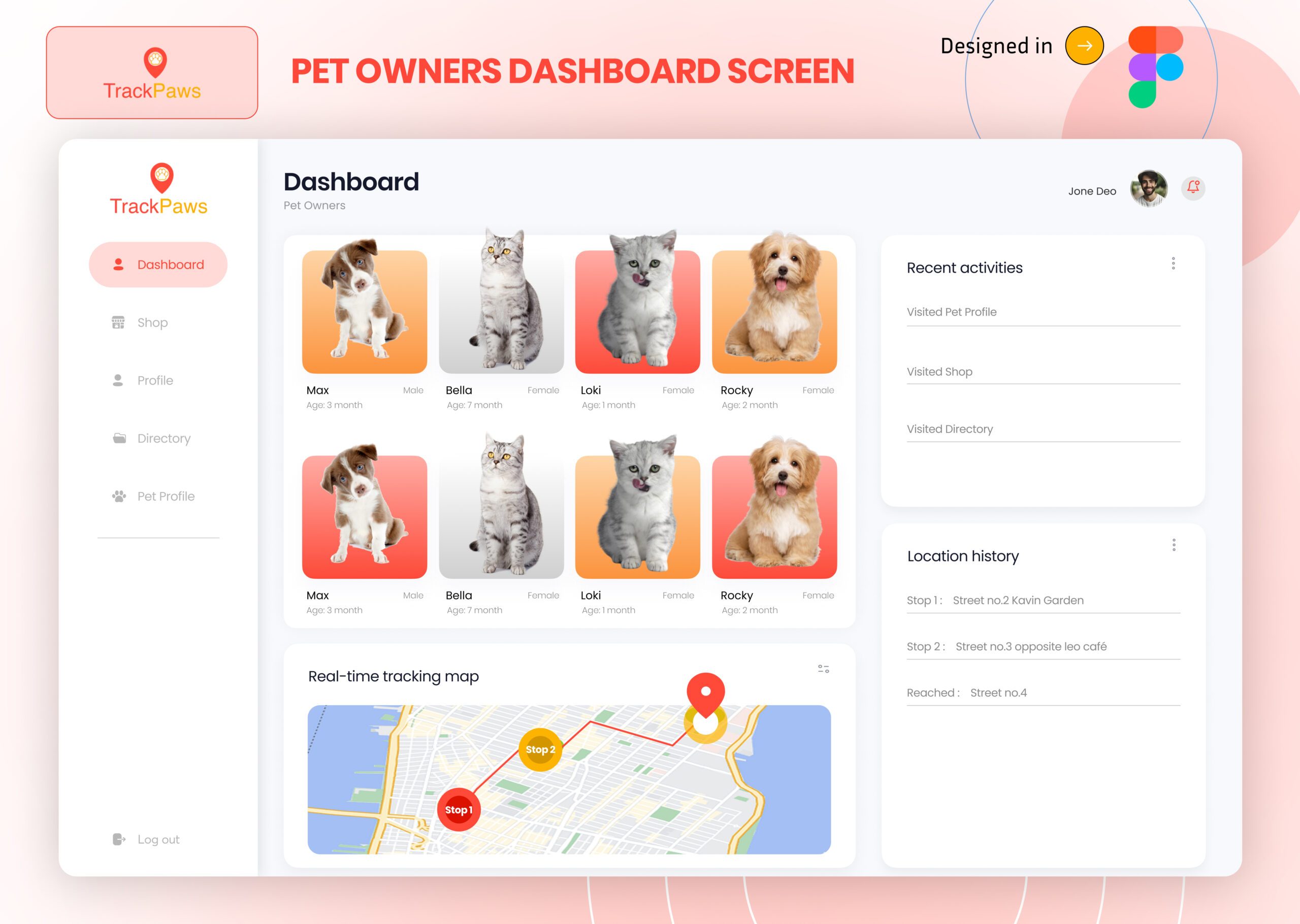
Pet Owners Dashboard Screen:

Research and Discovery
- User Research: The team conducts interviews and surveys with pet owners to understand their needs, pain points, and preferences.
- Competitive Analysis: They analyze existing pet owner dashboards and apps to identify strengths, weaknesses, and opportunities for improvement.
- Persona Creation: Based on the research, they create user personas representing different types of pet owners to guide the design process.
Defining Requirements
- Core Features: The team identifies essential features such as pet health tracking, vaccination reminders, appointment scheduling, and activity logs.
- User Stories: They create user stories to capture the interactions and tasks that users will perform on the dashboard.
- Technical Constraints: Collaborating with the development team, they outline any technical limitations or considerations.
Information Architecture
- Sitemap: The team designs a sitemap to organize the content and features logically.
- User Flows: They map out user flows to ensure smooth navigation and efficient task completion.
Wireframing
- Low-Fidelity Wireframes: Initial sketches or digital wireframes are created to establish the basic layout and structure.
- Feedback and Iteration: The team reviews wireframes with stakeholders and users, gathering feedback to refine the designs.
Visual Design
- Style Guide: They develop a style guide defining colors, typography, icons, and other visual elements consistent with ADMK Solutions’ brand.
- High-Fidelity Mockups: Detailed, polished mockups of the dashboard are created, showcasing the final look and feel.
Prototyping
- Interactive Prototypes: The team builds interactive prototypes using tools like Figma or Adobe XD to simulate the user experience.
- Usability Testing: Prototypes are tested with real users to identify usability issues and gather actionable feedback.
Iteration and Refinement
- Feedback Incorporation: Based on usability testing results, the design is iterated and refined to enhance user experience.
- Stakeholder Review: Final designs are reviewed and approved by stakeholders before moving to development.
Handoff to Development
- Design Specs: The team prepares detailed design specifications and assets for developers, ensuring accurate implementation.
- Collaboration: Designers work closely with developers during the implementation phase, providing support and making necessary adjustments.
Post-Launch Evaluation
- User Feedback: After launch, the team collects user feedback to identify areas for improvement.
- Analytics: They monitor usage data and analytics to assess the dashboard’s performance and user engagement.
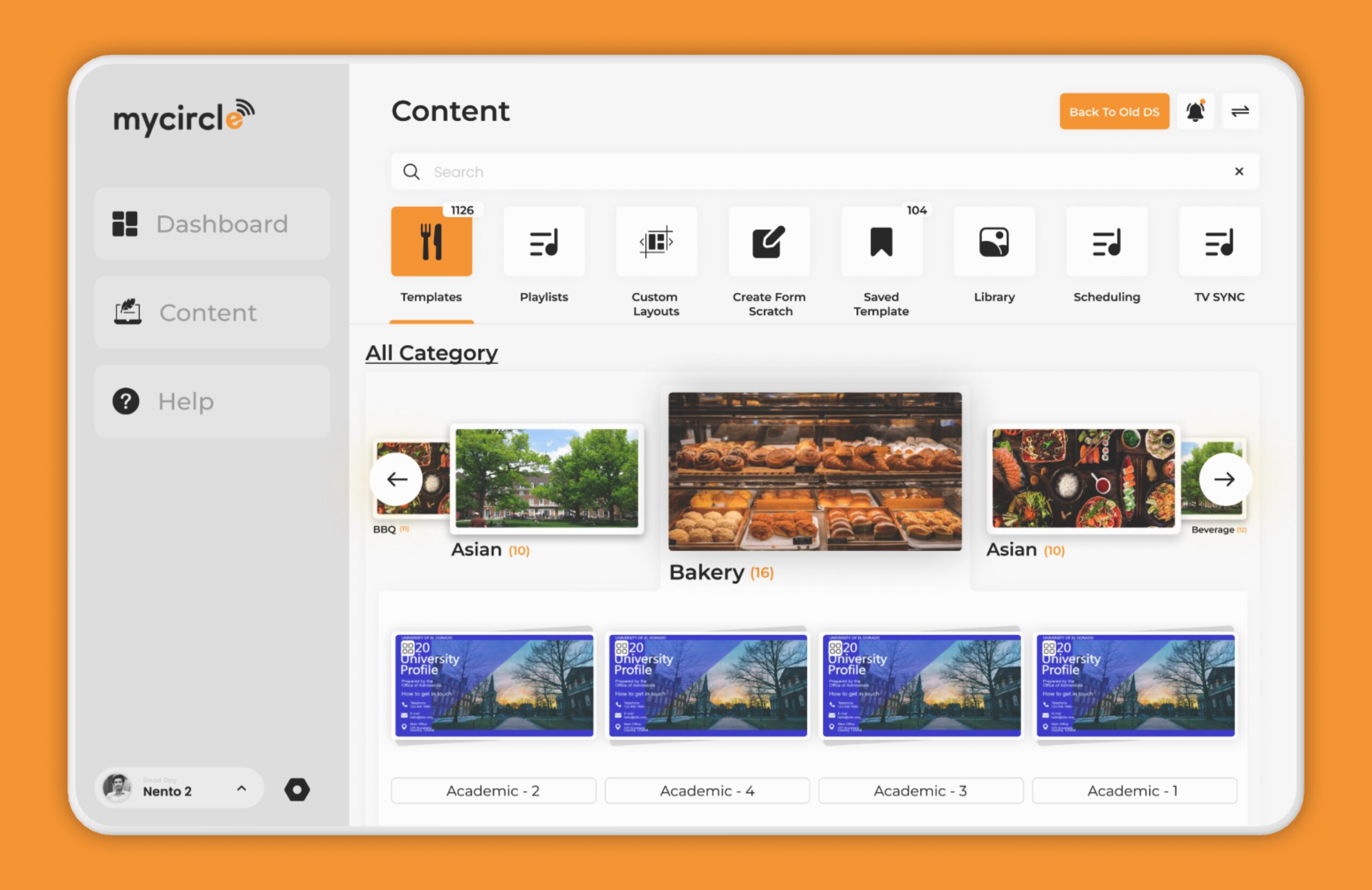
My Circle Dashboard Screen

Understanding the User Requirements
The first step involves understanding the user needs and requirements for the “My Circle” dashboard. The team conducts thorough research, including user interviews, surveys, and analyzing any existing data to gather insights on what users expect from the dashboard.
Defining Goals and Objectives
Based on the user requirements, the team defines the goals and objectives of the dashboard. This includes identifying the key functionalities, features, and user interactions that the dashboard should support.
Information Architecture and User Flow
The next step is to create the information architecture and user flow. The team maps out how users will navigate through the dashboard, ensuring a logical and intuitive flow of information. They create wireframes to outline the structure and layout of the screen.
Wireframing
Wireframes are created to visualize the basic structure of the dashboard. These low-fidelity sketches help in identifying the placement of elements such as navigation menus, buttons, charts, and other key components. The focus is on functionality rather than aesthetics at this stage.
Prototyping
After wireframing, the team develops interactive prototypes. These high-fidelity prototypes simulate the actual user experience, allowing stakeholders to interact with the dashboard and provide feedback. Tools like Figma, Sketch, or Adobe XD are often used for this purpose.
UI Design
With the feedback from the prototyping phase, the team moves on to the visual design. They focus on creating an aesthetically pleasing and user-friendly interface. This involves choosing a color scheme, typography, iconography, and other visual elements that align with the brand identity.
Usability Testing
The UI/UX design team conducts usability testing with real users to identify any issues or areas for improvement. This testing helps in ensuring that the dashboard is easy to use and meets the needs of the target audience. Feedback from this phase is crucial for refining the design.
Iteration and Refinement
Based on the feedback from usability testing, the team iterates on the design, making necessary adjustments and refinements. This iterative process continues until the dashboard meets the desired standards of usability and functionality.
Finalization and Handoff
Once the design is finalized, the team prepares detailed design specifications and assets for the development team. This includes annotated designs, style guides, and any other necessary documentation to ensure a smooth handoff.
Collaboration with Development
Throughout the development phase, the UI/UX design team collaborates closely with developers to ensure that the design is implemented accurately. They provide support and guidance to address any design-related issues that arise during development.
Post-Launch Evaluation
After the dashboard is launched, the team continues to monitor user feedback and performance metrics. This ongoing evaluation helps in identifying areas for further improvement and ensuring the dashboard continues to meet user needs effectively.
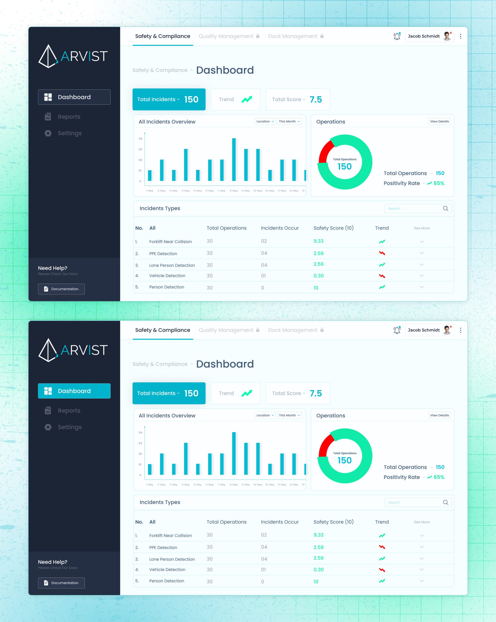
Arvist- Safety & Compliance dashboard SCREEN

Discovery and Research
Understanding Client Needs
- Initial Meetings: The team holds meetings with stakeholders from Arvist to understand their specific requirements, target audience, and goals for the Safety & Compliance screen.
- Questionnaires and Surveys: Conducting surveys or using detailed questionnaires to gather information about user needs and pain points.
Competitive Analysis
- Market Research: Analyzing competitors’ safety and compliance screens to identify industry standards and unique selling points.
- Benchmarking: Evaluating best practices and current trends in UI/UX design within the safety and compliance industry.
Defining User Personas and User Journey
User Personas
- Creating Personas: Developing detailed user personas based on the research to represent different types of users who will interact with the Safety & Compliance screen.
- Needs and Goals: Outlining the needs, goals, frustrations, and behaviors of each persona.
User Journey Mapping
- Journey Maps: Creating user journey maps to visualize the steps users will take when interacting with the Safety & Compliance screen.
- Touchpoints and Pain Points: Identifying key touchpoints and potential pain points to ensure a smooth user experience.
Information Architecture (IA) and Wireframing
Information Architecture
- Site Map: Developing a site map to organize and structure the content and navigation of the Safety & Compliance screen.
- Content Hierarchy: Defining the hierarchy of information to ensure clarity and ease of access.
Wireframes
- Low-Fidelity Wireframes: Creating low-fidelity wireframes to outline the basic layout and structure of the Safety & Compliance screen.
- Feedback and Iteration: Gathering feedback from stakeholders and iterating on the wireframes to refine the design.
Visual Design and Prototyping
Style Guide
- Brand Guidelines: Incorporating Arvist’s brand guidelines to ensure consistency in colors, typography, and visual elements.
- UI Elements: Designing UI elements such as buttons, icons, and forms that align with the brand’s aesthetic.
High-Fidelity Prototypes
- Creating Prototypes: Developing high-fidelity prototypes that include detailed visuals and interactions to represent the final design.
- User Testing: Conducting usability tests with actual users to gather feedback and identify areas for improvement.
Development Handoff and Implementation
Design Documentation
- Style Guides and Assets: Providing detailed style guides and design assets to the development team to ensure accurate implementation.
- Interactive Prototypes: Sharing interactive prototypes with developers to illustrate the intended functionality and user interactions.
Collaboration with Developers
- Regular Check-Ins: Holding regular meetings with the development team to address any questions or issues during the implementation phase.
- Quality Assurance: Ensuring that the final implementation matches the design specifications and provides a seamless user experience.
Post-Launch Analysis and Iteration
User Feedback
- Collecting Feedback: Gathering feedback from users post-launch to identify any usability issues or areas for improvement.
- Surveys and Analytics: Using surveys and analytics tools to monitor user behavior and satisfaction.
Continuous Improvement
- Iterative Updates: Making iterative updates based on user feedback and data to continuously enhance the Safety & Compliance screen.
- A/B Testing: Conducting A/B tests to compare different design variations and optimize the user experience.

